Stringland Tech V2.0 UX
Stringland Tech UX design has been updated. The basic idea is to use search bar, well organized cards and labels design, and adding more detailed description in each card. It will be easier for users to target the functionality they want. For function page, only the function related elements are retained.
Homepage
The homepage link is still the same:
https://stringland.github.io/web/
Here is the homepage screenshot:
Users can type keywords in search bar. The autocomplete can list top 10 candidate functions' names in the menu. Here is the screenshot:
All the functions are described in one corresponding card; and every card is under one corresponding label.
Currently there are 10 labels. Most of them are the same as old UX version:
* Math
* Physic
* Time
* Security (Hash, Password generation and AES encryption feature)
* Network (HTML, URL and IP conversion features)
* String
* Color
* Text Editor
* Games
* Upcoming features
Here is the sample screenshot:
If user click the card, s/he will be redirected to corresponding function page.
Function Page
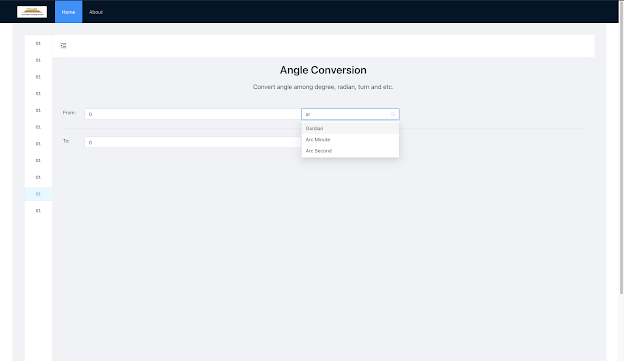
Function page now is much more concise. Only elements related to the function are retained. Those elements used for navigation have been removed.
Here is one sample screenshot:


Comments
Post a Comment